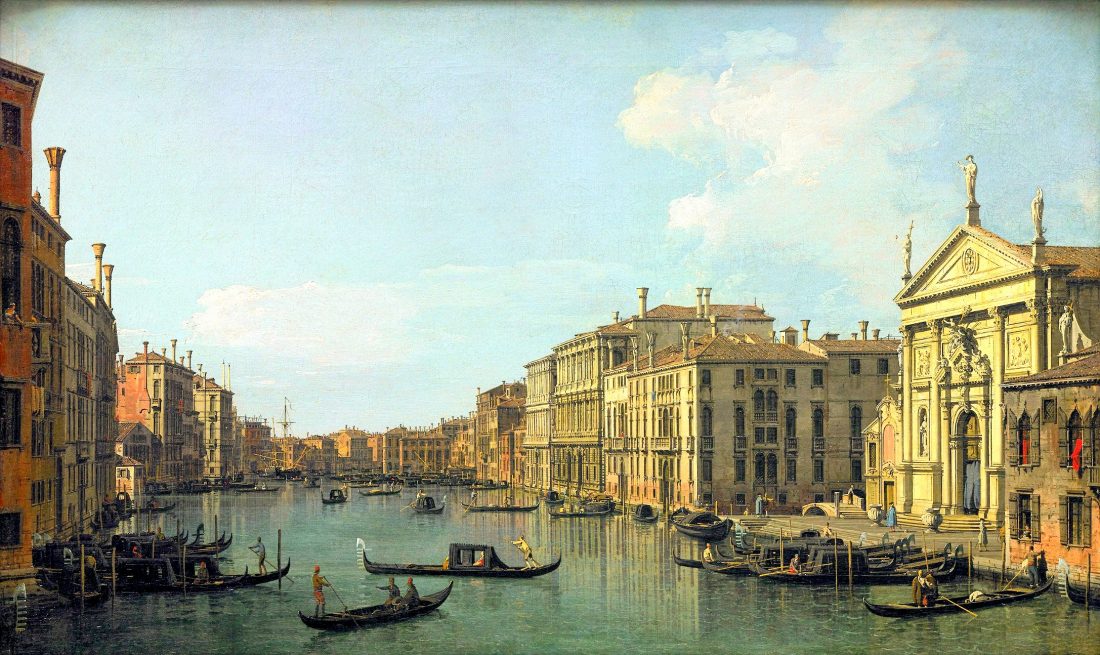
 "Perspective" in art is the systematic placing of visual information on a flat surface so that nearer objects appear larger than than those farther away. Early perspective painting was concerned with depicting architectural spaces, (see Canaletto's work, above). Much later art derived from photography since the lens projects a perspective image on a flat surface. I think Vermeer was the first to actually apply lens images in painting. If you have any doubts, look at the recent documentary, "Tim's Vermeer". Photographic perspective varies with the focal length of the lens, the longer the focal length, the more the perspective is compressed.
Wikipedia currently states, "Linear perspective is an approximate representation, generally on a flat surface, of an image as it is seen by the eye." This is nonsense. Perspective bears no resemblance to how the eye (and brain) process three dimensional visual information. Also from Wikipedia: perspective (from Latin perspicere 'to see through'). In the early 1970's at the Art Students League I was encouraged to think of perspective by imagining a pane of glass through which to view a subject for drawing or painting, and on which to record the perspective image. No art teacher actually tried this experiment, so I did so in my 7th Street loft. I stretched a sheet of clear plastic at arm's length and tried to draw the interior image of the loft on the plastic using a black marker. I was able to mark a point or two as seen through the plastic, but as soon as I focused on the plastic as opposed to looking through it, the interior image abruptly contracted because my eye refocused to arms length when viewing the marks I had drawn on the plastic. A few more tries also revealed that I could not reproduce the light values or colors of the seen image, since the light falling on the plastic was different that that illuminating the scene. I have since learned much more about our visual system and how different it is than the camera, but suffice it to say the concept of perspective is often antithetical to making art. An artist would do better to draw and paint the most noticeable elements in a scene, which is how the eye takes in information, rather than trying to arrange them in perspective.
1 Comment
 "When to stop? " can be applied to many moments in life. But I'm focusing now on:
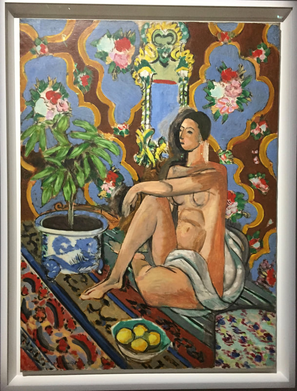
When to stop working on a painting or other piece of art? In other words, When is it finished? The short answer - a work of art is never finished until it leaves the artist's studio and sometimes not even then. I recall reading that the abstract painter Clifford Still was sued by the owner of one of his large canvas paintings. Years after it sold for big money, it was returned, damaged, to Still, rolled up, with a note essentially saying, "Fix it". About a year later Still sent it back. Still had completely painted over the original work. The Judge sided with Still, since the owner didn't specify how to fix it. Sometimes the answer to "When to stop?" is clear: a quick sketch that sings to you, or when you exhaust an overworked piece to further one's knowledge. But often you reach a stage in a work where it seems unified, but the question arises, should I leave it now, or continue on? You can always do more, but recall the late comic Gilda Radner's adage, "There's always something." It may be worth while to reframe the question from, "When to stop?" to "Should I continue?" My advice: 1. Stop work and sleep on it. Your creative brain (right side) has probably reached its limit and has turned things over to the analytic (left side) of your brain which is posing the question. 2. When you get up in the morning to study your work, your right brain will be in control again. If there is somewhere creative to go with that piece, then proceed. If not, sign and date it and start something new. The photo above is of a large Matisse masterpiece at the Pompidou Museum in Paris. Notice the shaded and scuffed area behind the sitter's head. Matisse must have reworked the head many times, but wisely left the resulting background alone when the portrait was complete.  Watercolor, Rock Harbor, Orleans, 2019
I have struggled with the question everyone is asked at some time or another, "What is your favorite color?" I guess on reflection, mine is the ice blue of a glacier I saw once in Glacier Bay, Alaska. Its novelty makes it my favorite. However, as an artist, I find it best to ditch the word "color". Instead I think about the properties of the colored paints I use. In this sense, painting becomes like cooking, where the particular ingredients and how they can be used and combined, are important, rather than some abstract concept of taste. My favorite blues are the pigments ultramarine blue and cobalt teal, which I use in water colors and acrylics. They usually cover the blue spectrum very well for me. I also use thalo blue which has a slight greenish cast and which also comes in green(er) and a red shade, the latter close to ultramarine. Cobalt blue sometimes makes a good upper sky color. But keep in mind that "color", as we see it, is relative. Blue is the name we give to things we see that absorb all of the visible spectrum except blue wave lengths. But the blue we see depends on how we see it. Blue sky at dusk is a dull blue. But if you are walking outside from an interior lit by artificial light, the sky will appear a bright electric blue, which fades to blue-grey over a few seconds as your visual system readjusts to darker lighting conditions. A blue crayon placed between two orange ones will give a stronger appearance than one placed between two yellow ones because our visual system is recording the wave length differences. with the orange wave length being farther away from blue than yellow. |
AuthorRichard Perry is an artist in Brewster, Massachusetts Archives
October 2021
Categories |
 RSS Feed